The Task:
Bankers Almanac has been utilised by the Finance and Banking industry for decades, with its significant 175+ year history. Originally published as a banking directory book in 1845, for the past 20 years the web version has been a market leader in Know Your Customer (KYC) and Financial Compliance data. However, over that period the product has also remained relatively unchanged, with new feature extensions being added as separate modules based on a more modern technology stack.
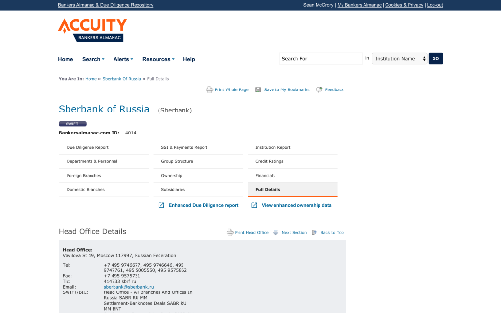
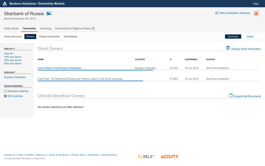
The Existing Applications


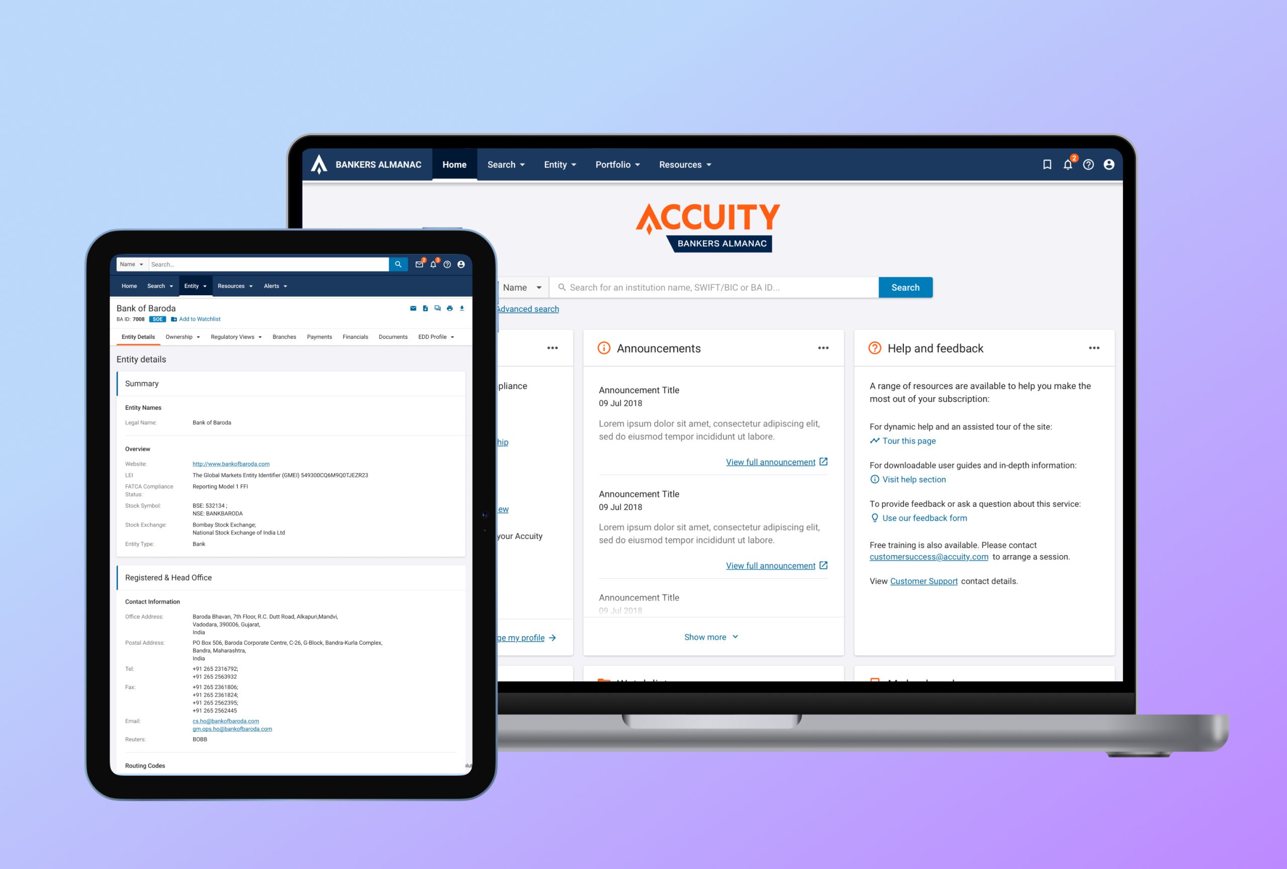
As part of wider business goals, a new consolidated database and API were being developed. This provided an opportunity to overhaul the current outdated ASP.net website and replace it with a modernised, customer focused WebApp solution with feature extensibility, scalability, accessibility and continuous enhancement in mind.
From a user experience point of view we wanted to focus on:
- Refining the information architecture to meet all modern information gathering needs of KYC Analysts, Compliance Officers and more.
- Seamlessly combine the two existing interfaces (The main KYC application and the Ownership Module).
- Enhance the current event alerting solution to meet a growing need for banks to execute more reactive and on-the-fly risk assessment of Counterparties (as opposed to the typical annual reviews carried out).
- Enable and surface dynamic risks, such as legal entity and country sanctions, political exposure, enforcements, and clear legal entity ownership.
- Align nomenclature with the most commonly understood terminology by KYC and Compliance departments in Banks.
My Role
This was a significant and large project, spanning 2 years. As the sole design representative on the development team, it was my responsibility to carry out the full breadth research and design tasks required.
My main responsibilities were:
- User Research
- UX Design & Visual Design
- Protoyping
Discovery
My first goal was to understand customer needs, what areas we could improve upon with a redesigned solution and any potential impact that would have on their existing user journey. I created a customer research plan and discussion guide to gain further insight covering four areas:
- Roles: Their role in their Bank and what tasks they perform as part of a team.
- Usage: What do they use the application for.
- Issues: What barriers/pain points do they have with the existing application.
- Recommendations: What suggestions they had for improvements/enhancements.
I recruited 19 participants for hour-long 1-to-1 sessions. On conclusion of the discovery research, I analysed the user feedback to identify common themes and gathered application usage and user journey data from analytics tools to better understand the patterns of behaviour of our users.
From this synthesis I formed several conclusions:
- There were discovery issues with the Ownership module. The majority of users were unaware of the presence of this feature. The link to this feature on the entity page was unintuitive and didn’t match the rest of the navigation.
- Most users were happy with the existing workflow but stated the user interface look very outdated.
- Users needed improvements to generate archive documents (PDF) for their company’s internal usage as they could only achieve this through their browser print dialogue.
- We needed to update our Personas – the sessions revealed there were users that did not fit our existing persona designations and so, were at risk of being missed during future business and feature considerations.
These findings informed my decision on how to proceed with the redesign. I suggested the following considerations:
- Refine, not completely rework – The information architecture should be refined, not completely redesigned, meaning with the visual redesign users will locate data where they already expect to find it, and we can also enable better discovery of features/data that would be useful for their due diligence process.
- Better export functionality – Export buttons that generate a clean, purpose-built PDF report, instead of confusing “Print” functionality to create archive copies.
- Bulk download of documents – Our most common user persona typically uses the product to gather all relevant risk-related data of a counterparty bank, and currently to download official documents (bank licence, Anti-Money laundering questionnaires etc) they have to download these one by one.
- Recently viewed – Many users review the same bank of several sessions. Having a list of their most recently viewed banks in an easily accessible area (home page and main navigation) enables a more efficient way to resume their work.
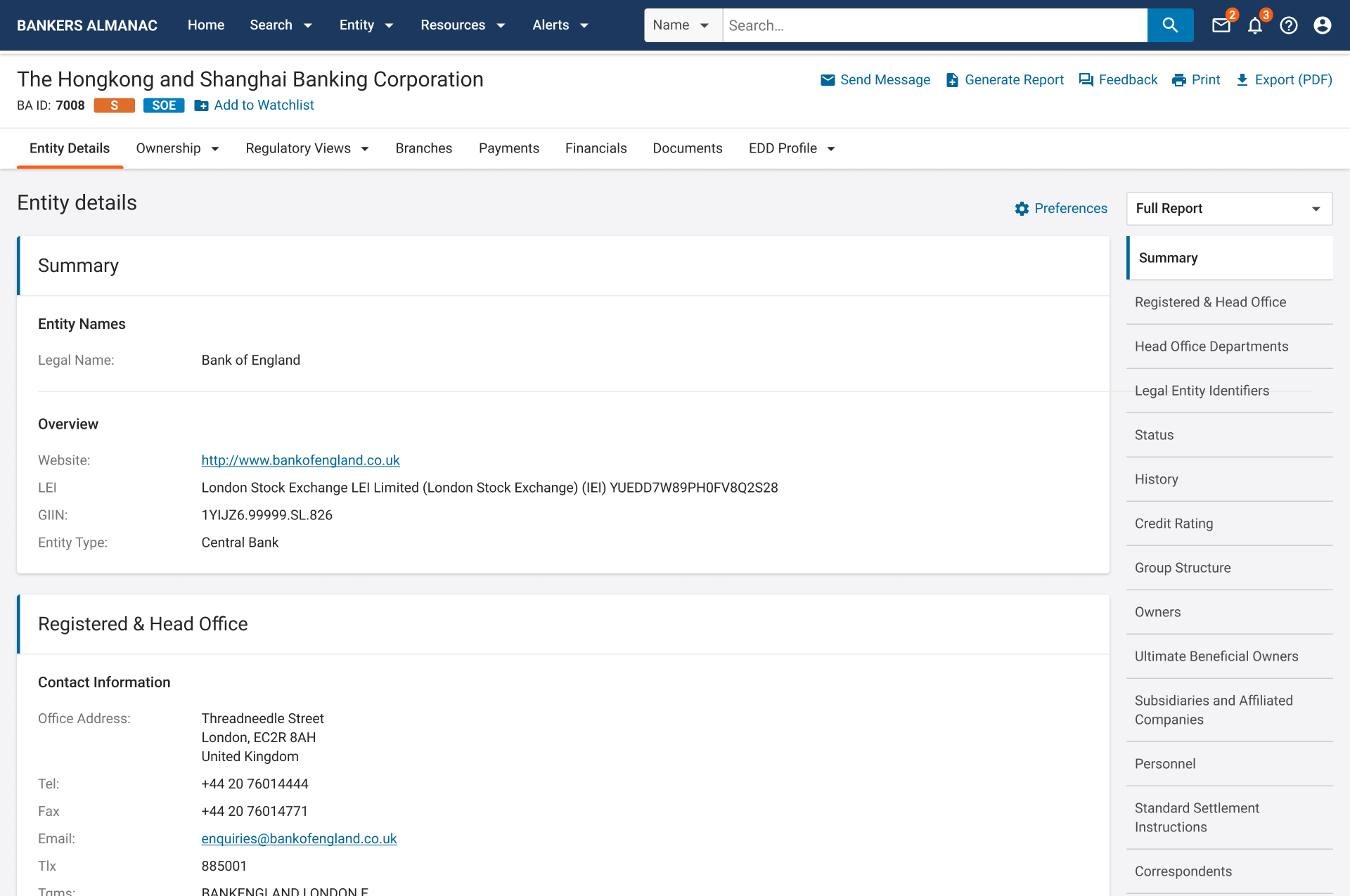
- Combine views – Many users don’t know that they can set a default view of data that is tailored to their specific needs. Adding the option to select that view and set it as default to a single report page would expose this feature more clearly and remove several entity sub-navigation items that were misplaced in the entity menu.
- Jump lists for long pages – A simple solution to help users quickly reach the data they need on exceptionally long pages with thousands of lines of institution information. On the existing product users would have to manually scroll through many long sections to get the information they need.
Other Considerations
Due to increased pressure and legislation from regulatory bodies, the expanding use of government sanctions and an overall drop in risk appetite from banks, there is a growing trend towards more reactive due diligence and “perpetual” KYC practices.
As market leader, the business wanted to greatly expand the risk offering in the product beyond simple weekly document and M&A alerts, to a full suite of dynamic risk alerts.
This required a complete rethink of the existing alerts system and how we would surface such risk information throughout the redesigned solution.
Design
Information Architecture
The work began with the refinement of the information architecture. Based on the discovery research and business requirements, I simplified the navigation of the entity information, while visually giving the space to allow for expanded information and features.
The “Alerts” menu item would now give quick access to Watchlist management, whilst the rarely used M&A and Document Bulletin boards were removed entirely, giving way for a Watchlist Alerts page that would provide a chronological list of all alert types.
Wireframes, Prototypes and Validation
To ensure my recommended design and navigation changes being made were clear to users, I organised internal and customer validation sessions.
I hosted ongoing feedback sessions with several customers, using wireframes as a discussion point. This was more productive in exposing data priority for users than the initial discovery feedback as the sessions were focused very much on the placement of data rather than high-level conversations about which data is needed for analysis.
When the stakeholders were satisfied with the wireframe structure I created a visual design pass of the screens in Sketch, alongside building key screen and user journey prototypes in Azure RP. I used these prototypes for task-based usability testing.
The test goals included the following:
- Identify critical errors with common task workflows.
- Evaluate time taken for users to complete testing tasks and compare to existing product baseline.
- Assess interest in new and enhanced features/data.
Visual Design

User Feedback
Some feedback from our users taken from our NPS feedback system:
Score: 10 “Very easy to find reliable data on banks”
Score: 10 “Easily accessible and generally thorough information uploaded.”
Score: 10 “Easy to use and usually with much of the needed information.”
Score: 9 “Easy to use, reliable, fast”
Score: 9 “Very easy to use!”
