PLEASE NOTE: This project design has been modified from the original to protect non-disclosure agreements.
The Task:
Institute X utilise a cloud-based, device agnostic portal to provide internal services to its members and assist administration duties. While it currently provided the necessary base functionality the institute required, they found that user adoption was poor and most members disengaged with the portal and opted to contact the administration department for query resolution.
The institute required an evaluation of the system to:
- Understand low user engagement of the system
- Discover pain points on a per user role basis
- Provide detailed suggestions to enhance user experience
My Role:
For this project, I obtained feedback from various stakeholders on the existing system to understand their disengagement and corresponding reasoning. I conducted user surveys and one to one interviews across a range of user groups to ensure a wide variety of feedback and use case contexts.
User Engagement
From the research carried out I discovered the top three reasons stakeholders avoided using the portal:
- Sessions timeout too short meaning users were often required to log into the app frequently causing frustration
- Most institute members were tech illiterate and therefore, avoided using the portal
- Some institute members were adverse to change and found usability issues on the portal frustrating enough to dismiss it’s use entirely
User Experience
Through feedback from user testing and performing heuristic evaluations of the existing system, I discovered a number of pain points and sources of confusion, including but not limited to:
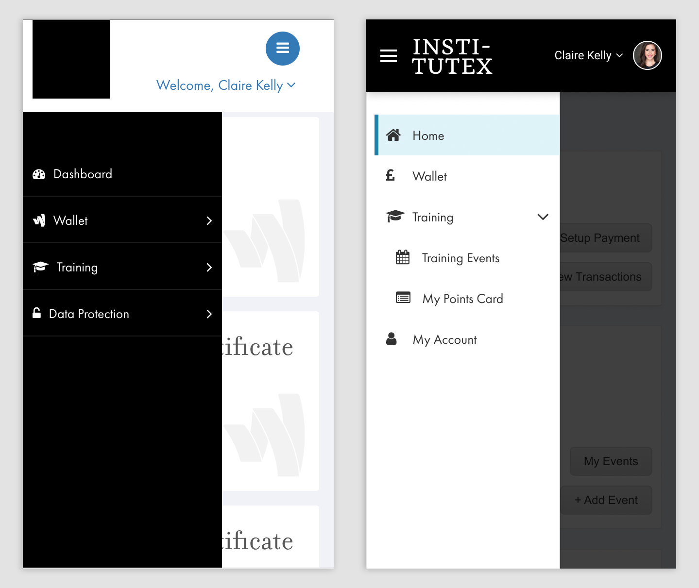
- Main Navigation – The navigation bar was convoluted and confusing. Link icons were occasionally visually unrepresentative of the related section, external links were not clearly marked as such and navigation on mobile was frustrating
- Site Orientation – Users would get frequently lost on the portal or confused on how to proceed due to unclear calls to action and section labelling
- Mobile – Table data with a large number of columns were frustrating to view and navigate, some areas were not fully optimised for touch or mobile viewport sizes
The Solution:
Training
Due to the number of non-technical users, I recommended the introduction of a training program to help on-board new and existing institute members to the portal. The training program provided a comprehensive guide on how to use the portal.
User Experience
Main Navigation
The main issues with the navigation were complexity due to depth, frustration for mobile/touch users and some issues with relevant iconography.
Layout and orientation
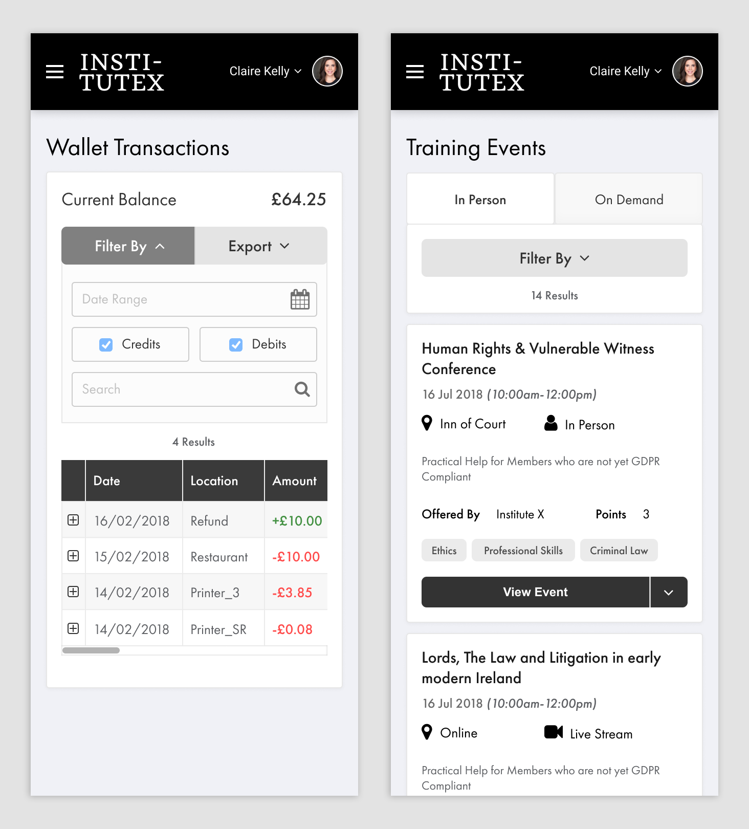
Previously users often lost track of their orientation on the portal. Various design changes were implemented to reduce confusion and give clear indicators to current location and clear calls to action. Some of these changes included:
- A cross-site layout structure was achieved with clear page titles which now consistently matched their corresponding menu links.
- A rework to the responsive design of several areas, to display entity lists in a touch-friendly way
New Feature Additions
As well as revamping the current features of the portal to enhance usability, I recommended several other features to aide in efficiency and provide a better experience.
Global Search
The Administration department is constantly providing assistance to members and additional support staff, such as supplying temporary card access, or making members aware their client has arrived for an appointment.
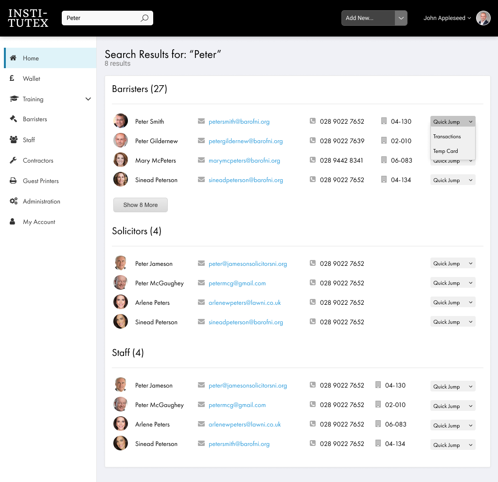
A global search provides a quick way to access a member or support staff and reduces the number of navigation steps required to find a user through previous methods.
Global “Add New” Dropdown Menu
An additional feature designed to improve admin staff efficiency, the “Add New” dropdown allows the user to quickly create any type of user, events and services without first navigating to their respective sections.
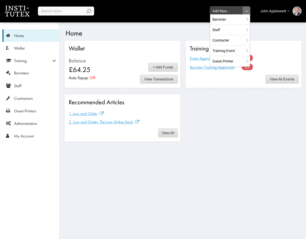
This suggestion was introduced as these shortcut links were removed from the main navigation bar as part of complexity and depth reduction.
My Account
Previously, user details were only accessible to administration staff. This meant users had to submit a support request to change basic information, such as their contact details or password. This often resulted in the admin staff sometimes being inundated with requests on top of daily duties.
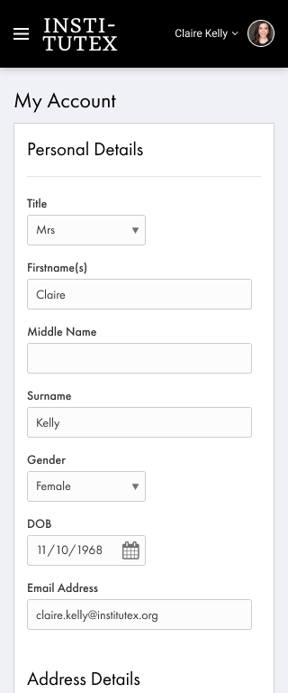
Users are now granted read and edit access to their own personal details, reducing workload for administration staff.
